
CSS Magic (Part II): Inheritance, Combinators, Box Model
Topics: Inheritance, Combinators, Box Model

In the previous article, I introduced you to the basics of CSS. In this article we will explore some more advanced topics - Inheritance, Combinators and the Box Model.
Inheritance
Inheritance in CSS refers to how some properties applied to a parent element are automatically passed down, or "inherited," by its child elements. This is a key concept because it helps manage styles more efficiently by reducing the need for repetitive code.
How Inheritance Works
When you apply a style to a parent element, certain properties will automatically apply to its child elements. This is because some CSS properties are inherently inheritable. For example, if you set the color of a parent element, all child elements will inherit that color unless you specify otherwise.
Example of Inheritance
Let's consider this simple HTML snippet:
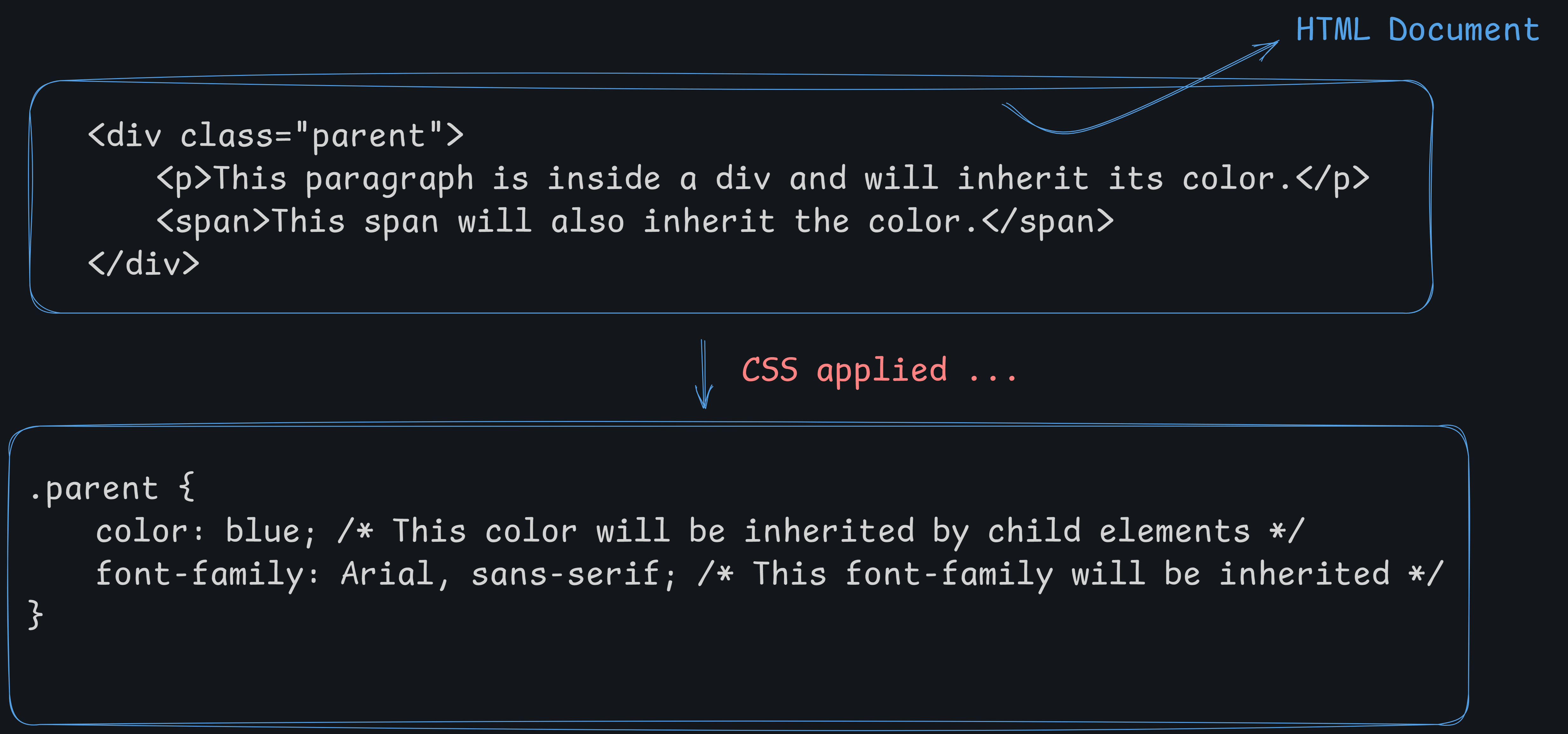
In this example:
The
divwith the classparentis the parent element.The
pandspanelements inside it are child elements.The
colorproperty (blue) andfont-family(Arial, sans-serif) are inheritable properties, so they will be applied to both thepandspanelements automatically.
Properties That Are Inheritable
Not all CSS properties are inheritable. Some commonly inheritable properties include:
Text properties:
color,font-family,font-size,line-height,text-align,visibilityList properties:
list-style,list-style-type,list-style-positionTable layout properties:
border-collapse,caption-side,empty-cells
Properties That Are Not Inheritable
Many properties are not inheritable by default, such as:
Box model properties:
margin,padding,border,width,heightPositioning properties:
position,top,left,right,bottomBackground properties:
background-color,background-image
Controlling Inheritance
CSS provides a way to explicitly control inheritance using the inherit, initial, and unset values:
inherit: Forces a property to inherit the value from its parent. For example:
.child { color: inherit; /* Forces this element to inherit the color from its parent */ }initial: Resets the property to its default value defined by the CSS specification, ignoring inheritance.
.child { color: initial; /* Sets the color to its default value (usually black) */ }unset: Resets the property to its natural state. If the property is inheritable,unsetwill act likeinherit; otherwise, it will act likeinitial.
Why Inheritance Is Useful
Inheritance helps to:
Simplify CSS: Reduces repetition by allowing you to set a property once for a parent element rather than individually for each child.
Maintain Consistency: Ensures a consistent look and feel throughout a webpage.
Improve Performance: Makes the CSS file smaller and more manageable.
Practical Example
Here's a practical example to understand how inheritance affects styles:
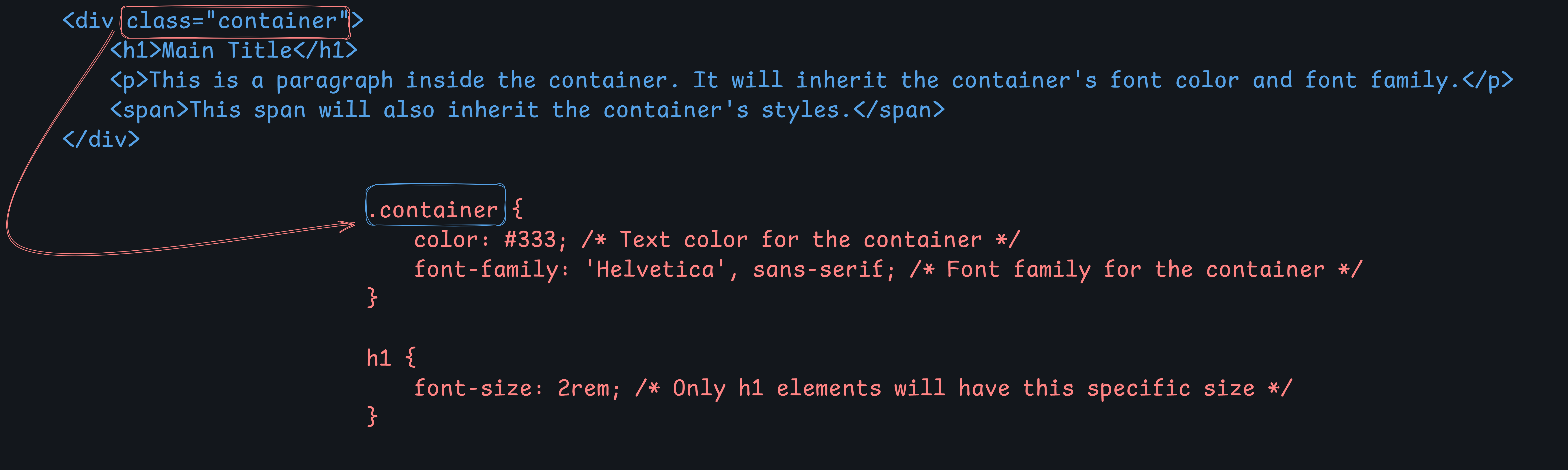
The
colorandfont-familyapplied to.containerwill be inherited by all child elements (h1,p,span).The
font-sizeapplied to theh1will not affect theporspanelements because it is specific to theh1.
Combinators in CSS
CSS combinators are used to define relationships between selectors, allowing you to style elements based on their relationship with other elements in the DOM. There are four main types of combinators in CSS:
Descendant Combinator (
Child Combinator (
>)Adjacent Sibling Combinator (
+)General Sibling Combinator (
~)
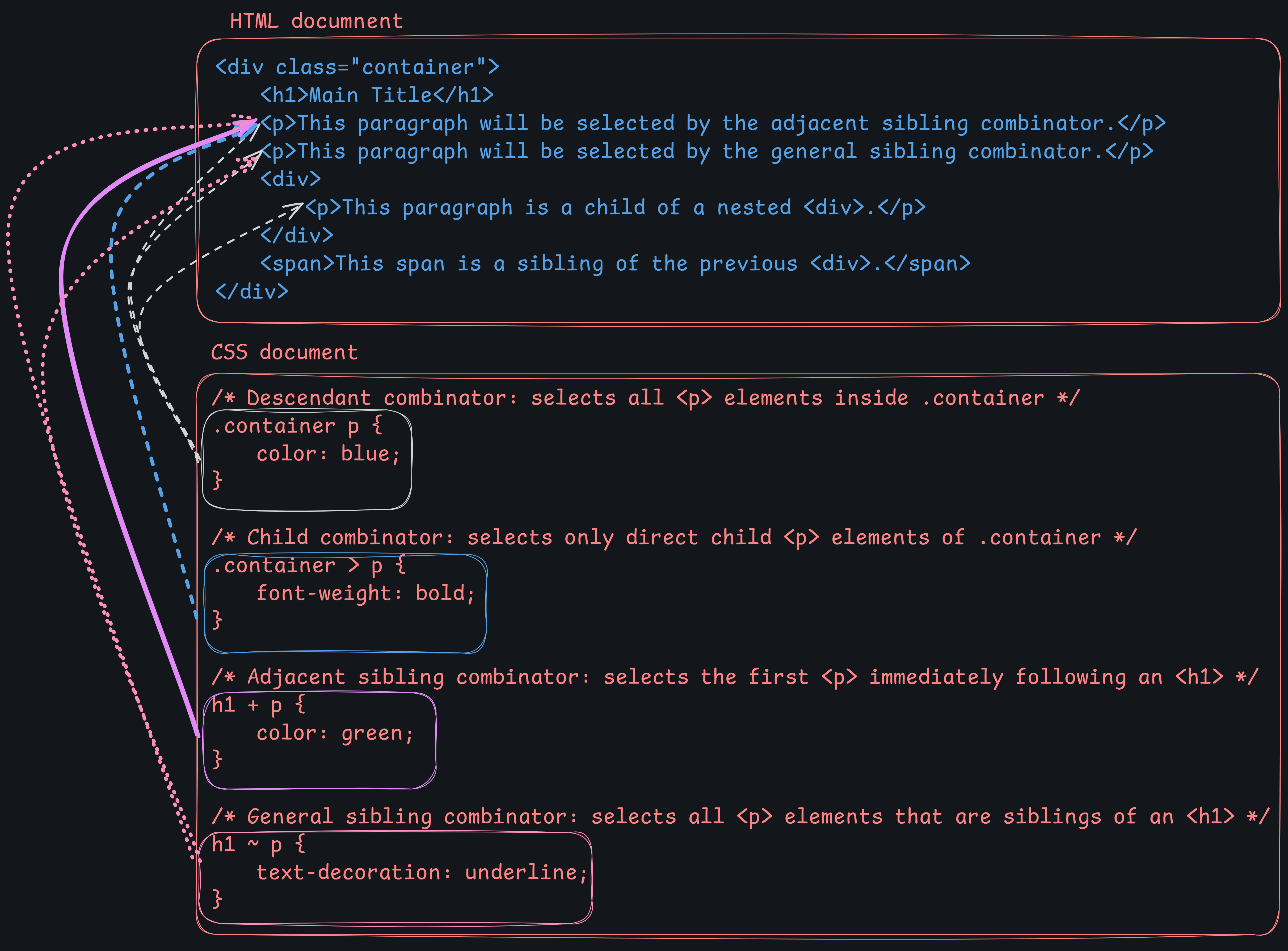
1. Descendant Combinator ( or space)
The descendant combinator selects all elements that are descendants of a specified element, regardless of their depth in the hierarchy.
Syntax:
parent child {
    /* styles */
}
Example:
/* All <p> elements inside a <div> */
div p {
   color: blue;
}
This will style all <p> elements that are nested anywhere inside a <div>, regardless of how deep they are in the hierarchy.
2. Child Combinator (>)
The child combinator selects all elements that are direct children of a specified element.
Syntax:
parent > child {
    /* styles */
}
Example:
/* Only direct child <p> elements of a <div> */
div > p {
    color: green;
}
This will style only the <p> elements that are direct children of a <div>. Any <p> elements further nested inside another element (e.g., a <span> inside the <div>) will not be selected.
3. Adjacent Sibling Combinator (+)
The adjacent sibling combinator selects an element that is immediately next to another element (i.e., the first sibling that follows the specified element).
Syntax:
element1 + element2 {
   /* styles */
}
Example:
/* Select the first <p> immediately following an <h1> */
h1 + p {
    margin-top: 0;
}
This will style the first <p> element that directly follows an <h1> element.
4. General Sibling Combinator (~)
The general sibling combinator selects all elements that are siblings of a specified element, regardless of their position.
Syntax:
element1 ~ element2 {
    /* styles */
}
Example:
/* Select all <p> elements that are siblings of an <h1> */
h1 ~ p {
    color: red;
}
This will style all <p> elements that are siblings of an <h1> element, even if there are other elements between them.
Practical Examples in HTML
Here's a sample HTML structure to demonstrate all the combinators:
Descendant Combinator (
Child Combinator (
>): Selects only direct children of a specified parent.Adjacent Sibling Combinator (
+): Selects the first element immediately following a specified element.General Sibling Combinator (
~): Selects all elements that are siblings of a specified element.
Let us now look into the result of this code:
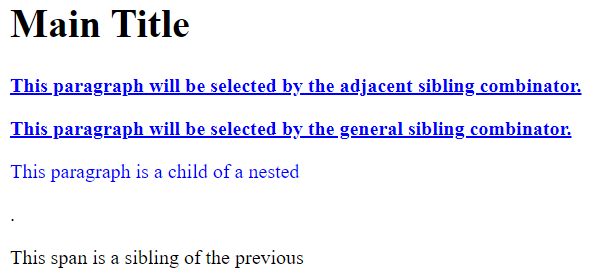
If you are not sure of the reason, do consider checking the concept of specificity discussed in the previous article, the link of which is provided at the start of the article!
Also, note the the div tags given as part of the text has not appeared on the screen! Try to modify this code a bit such that they are visible!
Box Model in CSS
The CSS Box Model is a fundamental concept that describes how elements are rendered on a webpage. Every element in HTML is considered a rectangular box, and the box model defines how the size of that box is calculated and how its elements are spaced.
Components of the Box Model
Content Box: The innermost part of the box where the actual content (like text, images, etc.) is displayed. Its size is determined by the
widthandheightproperties.Padding Box: The space between the content and the border. Padding adds extra space around the content. It's transparent and its size is controlled by the
paddingproperty.Border Box: The area surrounding the padding, defined by the
borderproperty. The border is visible and can have width, color, and style.Margin Box: The outermost part of the box that creates space between the element and surrounding elements. The margin is also transparent and its size is controlled by the
marginproperty.
Here's a visual representation of the CSS Box Model:
+----------------------------------------+
|              Margin                    |
|  +----------------------------------+  |
|  |            Border                |  |
|  |  +----------------------------+  |  |
|  |  |         Padding            |  |  |
|  |  |  +----------------------+  |  |  |
|  |  |  |      Content         |  |  |  |
|  |  |  +----------------------+  |  |  |
|  |  +----------------------------+  |  |
|  +----------------------------------+  |
+----------------------------------------+
Margin Collapsing
Margin collapsing occurs when the top and bottom margins of block-level elements meet. Instead of adding their margins together, the browser uses the larger of the two margins. This only applies to vertical margins (top and bottom), not horizontal margins (left and right).
When Margin Collapsing Happens
Adjacent siblings: When two block-level elements are next to each other, their vertical margins collapse into a single margin equal to the larger of the two.
Parent and first/last child: If a block element has no border, padding, or content, the top margin of its first child or the bottom margin of its last child will collapse with the parent's margin.
Empty block elements: If a block-level element is empty (contains no content, has no padding, or border), its vertical margins collapse.
Example of Margin Collapsing
<div class="box1">Box 1</div>
<div class="box2">Box 2</div>
.box1 {
margin-bottom: 20px;
background-color: lightblue;
}
.box2 {
margin-top: 30px;
background-color: lightgreen;
}In this example, you might expect box1 and box2 to have a 50px space between them (20px + 30px), but due to margin collapsing, the space will actually be 30px (the larger of the two margins).
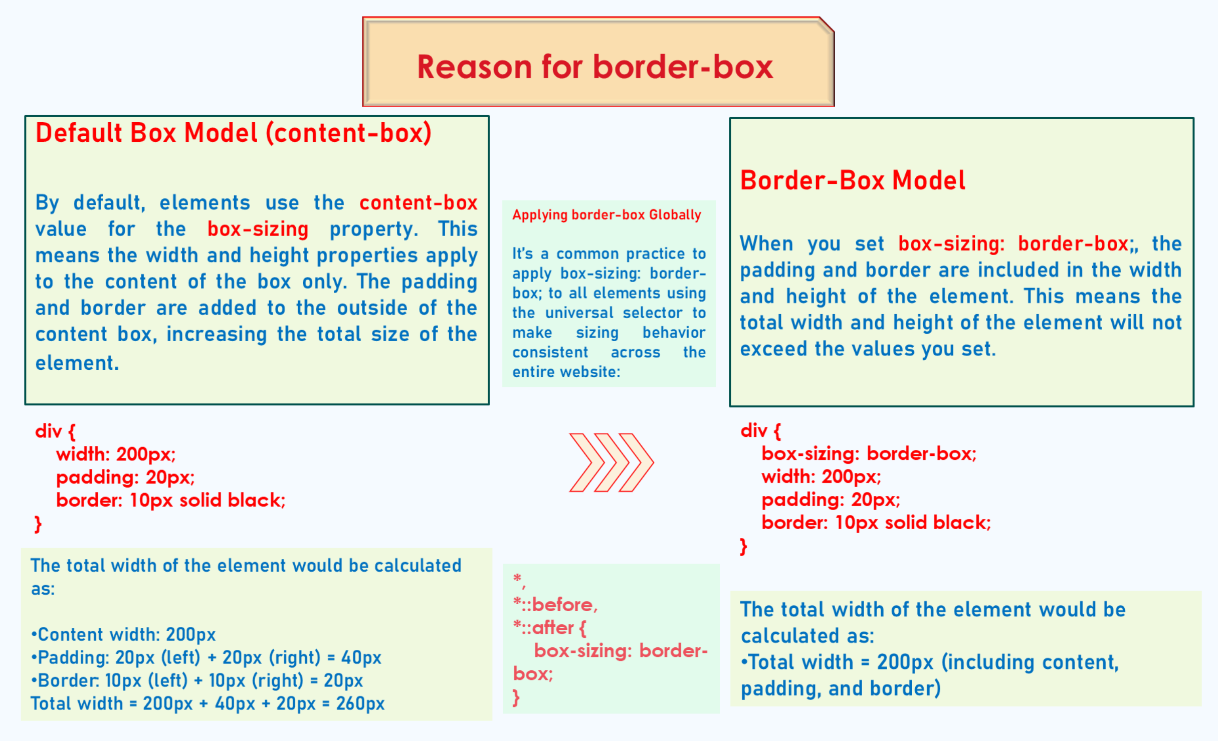
Need for box-sizing: border-box
By default, the width and height properties only apply to the content box. This means that when you set a width or height on an element, the padding and border are added to the specified width or height, making the final size of the element larger than expected.
For example, consider the following CSS:
.box {
    width: 200px;
    padding: 20px;
    border: 5px solid black;
}
The actual width of the element will be 200px (content) + 20px (left padding) + 20px (right padding) + 5px (left border) + 5px (right border) = 250px.
To prevent this behavior, you can use box-sizing: border-box;, which makes the width and height properties include the padding and border:
.box {
    width: 200px;
    padding: 20px;
    border: 5px solid black;
    box-sizing: border-box; /* Ensures total width remains 200px */
}
This ensures that the width of the element remains 200px, and the padding and border are drawn inside this width. This makes layout calculations easier and more predictable, especially when building responsive designs.
Why box-sizing: border-box is Needed
Simplifies Layouts: Makes it easier to build responsive layouts where the total width or height of an element is predictable.
Prevents Overflow: Prevents elements from accidentally overflowing their containers due to added padding or borders.
Consistency Across Elements: Provides consistent behavior across different elements, making CSS more manageable.
Why Inline Elements Do Not Respect width and height
Inline elements (like <span>, <a>, <strong>) do not respect the width and height properties because they are designed to flow within a line of text.
Characteristics of Inline Elements
Flow Within Text: Inline elements are laid out in a line (i.e., inline with the text), and their width is determined by the content they contain.
Cannot Have Width/Height: You cannot explicitly set the
widthorheightof an inline element. These properties have no effect because inline elements only take up as much width as their content requires.Padding, Margin, and Borders: Inline elements respect left and right padding, margins, and borders but ignore top and bottom padding, margins, and borders. However, these will not change the height of the line itself.
Example
Consider this example:
<p>This is a <span class="highlight">highlighted text</span> in a paragraph.</p>.highlight {
background-color: yellow;
width: 100px; /* Has no effect */
height: 50px; /* Has no effect */
padding: 10px; /* Left and right padding will be applied, but not top and bottom */
}The
widthandheightproperties won't affect the inline<span>.However, you can change the element's behavior by making it inline-block:
.highlight {
    display: inline-block; /* Allows width and height to be respected */
    width: 100px;
    height: 50px;
    padding: 10px;
}
By using display: inline-block;, the element retains its inline characteristics (flows in line with text) but also respects width, height, and top/bottom margins/padding.
Thus,
The CSS Box Model helps define the structure and spacing of elements on a webpage.
Margin collapsing reduces vertical space by merging adjacent margins.
box-sizing: border-box;makes layout calculations more predictable by including padding and borders within the specified width and height.Inline elements do not respect
widthandheightbecause they are meant to flow within text, but this behavior can be altered usingdisplay: inline-block.
Properties in CSS worth remembering!
color: Sets the text color inside the content.
background-color: Sets the background color of the content.
display: Defines how an element is displayed on the page (block, inline, flex, grid, etc.).
padding: Sets the space between the content and the border.
border: Sets the border around the padding and content area.
margin: Sets the space outside the border, creating space between elements.
width: Defines the width of the content area.
height: Defines the height of the content area.
Let us focus on the display property a bit!
Display Property
The display property in CSS is one of the most important properties used for controlling the layout of elements on a web page. It defines how an element is displayed in the document flow—whether it is treated as a block, inline, flex, grid, or any other type of element.
Types of display Property Values
There are several values for the display property, each affecting the element’s rendering and its relation to other elements. Here are the most common ones:
display: block;Definition: The element is displayed as a block-level element. Block-level elements always start on a new line and take up the full width available (by default).
Examples:
<div>,<p>,<h1>to<h6>,<section>,<article>.Characteristics:
Takes up the full width of its container.
Respects
widthandheightproperties.Respects
margin(all sides) andpadding.Forces a line break before and after the element.
display: inline;Definition: The element is displayed as an inline-level element, which means it does not start on a new line and only takes up as much width as necessary.
Examples:
<span>,<a>,<strong>,<em>.Characteristics:
Does not respect
widthandheightproperties.Only takes up as much width as the content inside.
Respects left and right
paddingandmarginbut not top and bottom.Does not force a line break; elements are laid out in line with text.
display: inline-block;Definition: Combines the characteristics of both
inlineandblockelements. The element is formatted like an inline element but can acceptwidthandheightvalues.Examples:
<button>,<input>.Characteristics:
Takes up only as much width as its content, unless
widthis specified.Respects
width,height,margin, andpaddingon all sides.Does not force a line break (elements can sit next to each other).
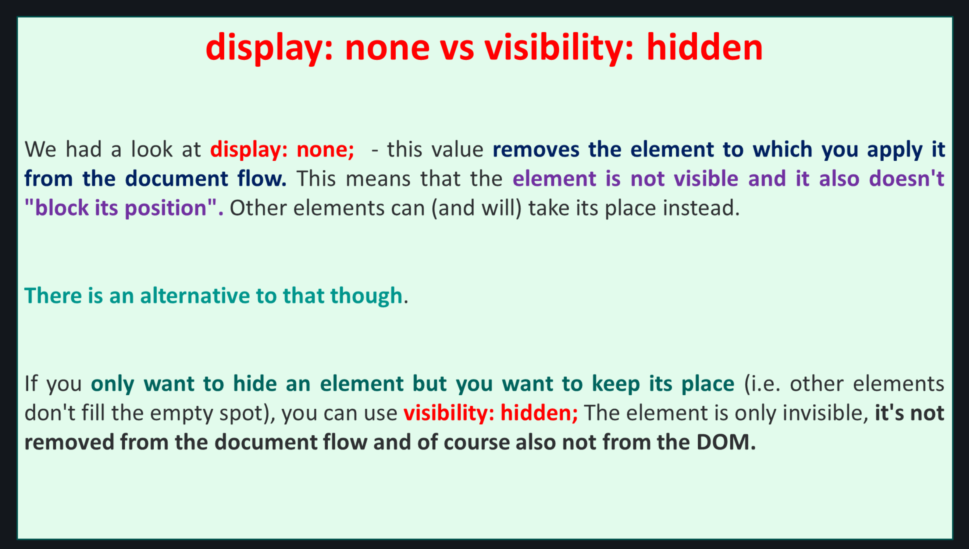
display: none;Definition: The element is completely removed from the document flow, as if it does not exist. It does not occupy any space on the page.
Characteristics:
The element is not displayed at all (invisible).
It does not occupy space in the document.
Other elements behave as if the hidden element is not present.
Commonly used for hiding elements dynamically (e.g., with JavaScript).
display: flex;Definition: The element becomes a flex container and its children become flex items. Flexbox provides an efficient way to lay out, align, and distribute space among items in a container, even when their sizes are unknown or dynamic.
Examples: Often applied to a
<div>or other container elements.Characteristics:
Provides alignment and distribution of space among items.
Allows for responsive and dynamic layouts.
Items within a flex container can grow, shrink, and be aligned vertically or horizontally.
display: grid;Definition: The element becomes a grid container, and its children become grid items. Grid layout allows for the creation of complex two-dimensional layouts.
Characteristics:
Provides both columns and rows for a structured layout.
Can define grid areas and control the size and positioning of child elements.
Useful for creating complex and responsive layouts.
display: inline-flex;Definition: Similar to
flex, but the element itself is formatted as an inline element.Characteristics:
Acts like an inline element but has the capabilities of a flex container.
Useful when you want to use Flexbox properties on elements without forcing a line break.
display: inline-grid;Definition: Similar to
grid, but the element itself is formatted as an inline element.Characteristics:
Acts like an inline element but has the capabilities of a grid container.
Useful for creating grid layouts that flow with text or are inline with other content.
display: table;Definition: The element behaves like a
<table>element.Characteristics:
Used to create table-like layouts without using actual table elements.
Allows for the creation of table rows (
display: table-row;), cells (display: table-cell;), and other table components.
display: contents;Definition: Makes the element disappear from the layout, while its children are treated as if they were direct children of the parent element.
Characteristics:
The element itself is not rendered, but its children are rendered as if they were children of the parent of the
display: contentselement.Useful for style and accessibility when the element itself should not affect layout.
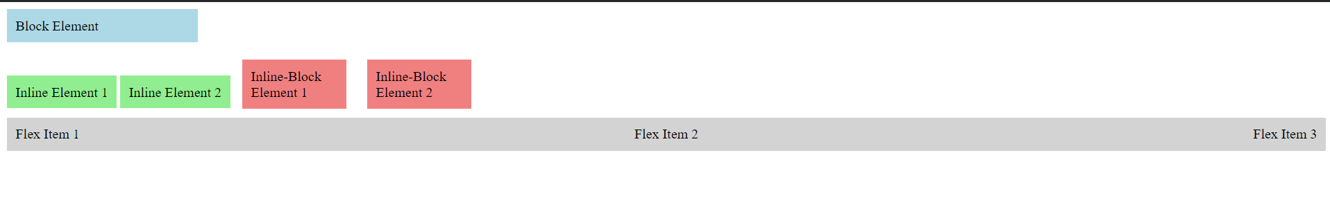
Examples of display Property
Here's an example that shows different values of the display property:
The result is as follows:
NOTE
NOTE - Don’t PANIC!
I have provided a detailed structure for the display property. There are some properties that you may not understand now like flex and grid! Don’t worry! you'll get hold of it once we understand flexbox and grid in CSS.
Conclusion
In mastering CSS, understanding the fundamentals is key to creating visually appealing and responsive web designs. We've delved into the core concepts like inheritance, which dictates how properties are passed down through the DOM, and combinators, which define relationships between selectors for precise styling. The box model is essential for managing spacing, encompassing content, padding, borders, and margins, while the border-box property helps streamline layout management by including padding and borders within the defined width and height. Margin collapsing, another vital concept, prevents unwanted spaces between block elements.
Additionally, focusing on essential properties such as display reveals how elements behave in the layout—whether inline, block, flex, or grid. This understanding allows developers to craft sophisticated, responsive designs that adapt beautifully across devices. With these concepts at your fingertips, you're better equipped to control every aspect of your layout, enhancing both user experience and design aesthetics. Keep practicing, experimenting, and combining these CSS properties to unlock the full potential of your web projects. Happy coding!